The Recovery: It Still Doesn't Look Good
Sep. 24th, 2012 03:41 pmTime to revisit a neat-o graph that I first shared over a year and a half ago from Calculated Risk:

Bigger!
Last February, it looked like this:

Bigger Still!
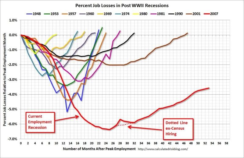
I'm bummed that the graph maker didn't keep the format of the original, which zeroed each trough and thus revealed the symmetry of recessions/depressions, how they generally took as long in recovery from trough as they took to achieve the lowest point. Still, with a little squinty-eyed study, one can see that this time, it really is different.
So now we come to the most recent Calculated Risk chart, one that's been knocking through the blogs enough to even catch usually somewhat slow on the draw Planet Money:

Even Bigger Still!
I'm wondering how long it will take economists to note (like Doug Short) that something out of the ordinary is prolonging our economic travails, perhaps something missing from this recovery that was still relatively abundant in the last. Could it be . . . cheap fuel?
Could be. Could be at that.
Bigger!
Last February, it looked like this:
Bigger Still!
I'm bummed that the graph maker didn't keep the format of the original, which zeroed each trough and thus revealed the symmetry of recessions/depressions, how they generally took as long in recovery from trough as they took to achieve the lowest point. Still, with a little squinty-eyed study, one can see that this time, it really is different.
So now we come to the most recent Calculated Risk chart, one that's been knocking through the blogs enough to even catch usually somewhat slow on the draw Planet Money:
Even Bigger Still!
I'm wondering how long it will take economists to note (like Doug Short) that something out of the ordinary is prolonging our economic travails, perhaps something missing from this recovery that was still relatively abundant in the last. Could it be . . . cheap fuel?
Could be. Could be at that.