The Recovery: So Far So Bad
Jan. 6th, 2012 06:52 pmAlmost a year ago, I shared a graph from Calculated Risk of various economic crises of the past overlayed on the current one:

Embiggenate the history.
Back then, I noted that recessions usually take as long to a make a full recovery as it took to get to the trough. Based on that, I said 15 months would be the real test. It hasn't been 15 months, I know, but let's see how much progress is being made by looking at this recent Spencer England piece over at the Angry Bear:

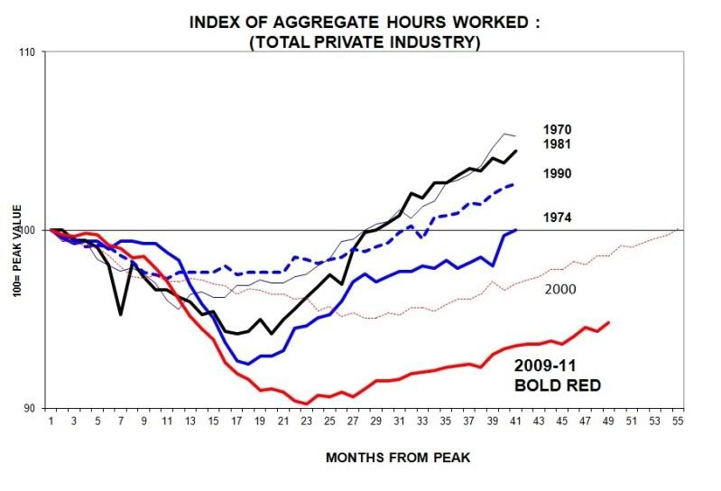
Enlarge the recovery.
Some caveats: First, it looks like The Angry Bear graph only includes employment in private industry, rather than combining private and government figures. That would explain the difference in how far the bottom seems to have fallen in this recession, ±7% verses just under 9%.
[See note at bottom to explain the strikeout.]It also looks like the Angry Bear has the employment bottom at 23 months from peak, while Calculated Risk has it at 25. It's possible CR "smoothed" the data, taking a running average of the months just prior and just after the month graphed to minimize seasonal employment and other sudden, jolting effects. (It's also likely that both smoothed the data, but that CR added more months before and after the graphed to enhance the smoothing.) That mini "double dip" at the bottom of the Angry Bear graph between months 23 and 27 would average out at 25, giving credence to my theory. That would play havoc with comparing the other recessions. For example, check out the CR 1974 line (teal) and compare that with the blue '74 Angry Bear line. It looks like AB allowed more months from start of the downturn, 17 rather than 6, which is what might expect with smoothing (not to mention the data lack of less shock-sensitive government employment). That long slight dip from start to ±12 months would smooth right out of the line, shortening it considerably. This means we're not really looking at the same data; only two lines based (presumably) on the same data, one smoothed and one more rough.
Still, looks like we've got a lot of recovery to make to get back to "normal", don't it? I'll keep my eye on Calculated Risk sometime after July to see if we make it back, or if this one, like the '74 oil-based recession, is going to run a bit longer . . . you know, like until we develop a technology just as energy-dense and inexpensive as petroleum.
Edit, The Next Morning:![[livejournal.com profile]](https://www.dreamwidth.org/img/external/lj-userinfo.gif) cieldumort points out that the two graphs actually track different things, job losses verses hours worked. I am an idiot for equating the Angry Bear line for the Calculated Risk line. The correlation between the two data points is still striking to me, but not the same. Therefore the talk of data smoothing very probably doesn't apply here.
cieldumort points out that the two graphs actually track different things, job losses verses hours worked. I am an idiot for equating the Angry Bear line for the Calculated Risk line. The correlation between the two data points is still striking to me, but not the same. Therefore the talk of data smoothing very probably doesn't apply here.
Embiggenate the history.
Back then, I noted that recessions usually take as long to a make a full recovery as it took to get to the trough. Based on that, I said 15 months would be the real test. It hasn't been 15 months, I know, but let's see how much progress is being made by looking at this recent Spencer England piece over at the Angry Bear:
Enlarge the recovery.
Some caveats: First, it looks like The Angry Bear graph only includes employment in private industry, rather than combining private and government figures. That would explain the difference in how far the bottom seems to have fallen in this recession, ±7% verses just under 9%.
[See note at bottom to explain the strikeout.]
Still, looks like we've got a lot of recovery to make to get back to "normal", don't it? I'll keep my eye on Calculated Risk sometime after July to see if we make it back, or if this one, like the '74 oil-based recession, is going to run a bit longer . . . you know, like until we develop a technology just as energy-dense and inexpensive as petroleum.
Edit, The Next Morning: